
An equity curve is your cumulative net profit and loss plotted trade by trade or day by day, and its slope tells you almost everything about whether to keep risking size or pull back. When the line trends up with shallow pullbacks, current sizing is working. When it grinds sideways or drops past a drawdown level you validated in advance, that's your cue to cut size, pause, or review the strategy. The sections below walk through the metrics, diagnostics, and rules that turn that single line into a real decision.
TL;DR:
- Strategies with a growing equity curve should be examined for widening gaps between gross and net profit due to execution costs, especially with high trade frequency.
- Key risk metrics, such as maximum drawdown and the ulcer index, provide more meaningful insights into potential strategy deterioration than simple profit figures.
- Analyzing the equity curve in segments, considering market regimes and seasonality, helps distinguish real structural issues from normal market variance.
- Automated monitoring tools can track drawdowns, execution quality, and trade performance continuously, supporting disciplined risk management.
- Relying on equity-curve-based filters requires a minimum of 100 trades per year to avoid noise and false signals.
Table of Contents
- What Equity Curve Analysis Actually Measures
- The Metrics That Turn a Line Into a Diagnosis
- How to Analyze an Equity Curve Without Fooling Yourself
- Building Equity Curve Risk Controls That Actually Hold
- Your Equity Curve Analysis Workflow, Step by Step
- How Discipline AI Supports Equity Curve Monitoring
- A Trader's Honest Take on Mechanical Rules
- Automate the Monitoring, Keep the Judgment
- Sources
- FAQ
What Equity Curve Analysis Actually Measures
Equity curve analysis starts with a choice: trade-based or time-based plotting. A trade-based curve advances one point per closed position, which suits strategies with irregular trade frequency. A time-based curve advances daily or weekly, which suits comparing a strategy against a benchmark or across different market conditions. Neither is wrong, but mixing them without labeling the axis is how traders misread flat stretches as losing streaks that were really just quiet weeks.
Building the curve is arithmetic, not modeling:
- Sort every trade by close time and record its net P&L.
- Run a cumulative sum down the list, plotting each running total as a point.
- Track gross equity (raw price P&L) alongside net equity, which subtracts commissions, spreads, and slippage.
The gap between gross and net curves widens with trade frequency. A strategy firing 300 trades a year on tight spreads can see its edge erased entirely by execution costs, something backtested curves routinely hide because simulated fills are cleaner than live ones. You need entry time, exit time, position size, fees, and a rule for marking open positions to market so the curve doesn't jump when a trade finally closes.
The Metrics That Turn a Line Into a Diagnosis
A rising line tells you a strategy made money. It doesn't tell you how much pain the equity curve inflicted along the way, and pain, not average return, is what usually gets traders to abandon a working system at the worst possible time.
Four metrics do the real work:
- Maximum drawdown (MDD): the largest peak-to-trough decline in equity, expressed in dollars or percent, along with how long it took to recover.
- Recovery factor: net profit divided by max drawdown. A recovery factor of 3 or higher generally signals a strategy that earns back losses faster than it accumulates them.
- Ulcer Index: squares the depth and duration of every drawdown and averages them, so a curve that stays underwater for months scores worse than one that dips sharply and snaps back.
- Sharpe and Sortino ratios, plus profit factor: these summarize risk-adjusted return, but both degrade in reliability below roughly 30 to 50 trades.
Statistic Callout: Practitioner guidance generally recommends waiting for 100 or more trades per year before trusting any equity-curve-based filter signal. Fewer trades produce noise that looks like a trend.
Point-in-time risk measures like Value at Risk miss the story a drawdown tells over weeks. Ulcer Index and drawdown duration capture cumulative damage in a way a single-day risk snapshot cannot, which is why they matter more when the actual decision on the table is whether to stay in a strategy or step away from it.
How to Analyze an Equity Curve Without Fooling Yourself
Reading a curve well means separating a real structural break from ordinary variance. Most traders get this backward: they react to every dip as if it's a regime change, then ignore the one dip that actually was.
Run these diagnostics before touching your sizing:
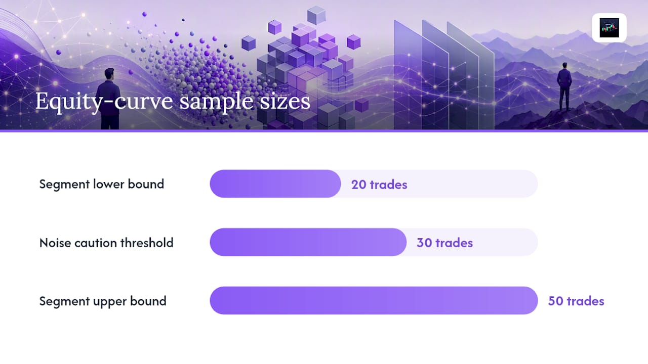
- Segment the curve into blocks of 20 to 50 trades, or by volatility regime, and compare slope and drawdown across blocks. A strategy that only works in trending markets will show a visibly different segment during chop.
- Check for seasonality and regime dependence. Segmenting equity curves by time period or market condition often reveals whether an edge is persistent or tied to a specific stretch that won't repeat.
- Confirm sample size before drawing conclusions. Below 30 to 50 trades, a "losing streak" is often just statistical noise, not a broken edge.
- Compare live fills against backtest assumptions. A curve that looked smooth in simulation and turns lumpy live usually points to slippage or execution quality, not a strategy failure.
- Rank red flags by severity. A widening gap between gross and net equity deserves more urgency than a single below-average week.
Pro Tip: Keep a separate curve for each market regime you trade (trending, ranging, high volatility) instead of one blended line. A blended curve can look healthy while masking a strategy that's quietly dying in one specific condition.
The biggest analysis mistake isn't missing a red flag. It's treating every red flag with the same urgency, which either causes traders to abandon working strategies over normal variance or ignore genuine deterioration because "it recovered last time."
Building Equity Curve Risk Controls That Actually Hold
Equity curve control means turning the curve itself into an input for sizing decisions, not just a report card you check after the fact. The two most common mechanical tools are moving-average filters and drawdown thresholds, and both come with real trade-offs.
A moving-average filter compares current equity against its own trailing average (commonly a 10 to 20 trade window) and cuts size or pauses trading when equity drops below that line. The lookback should scale with trade frequency: a strategy trading twice a week needs a much longer lookback in calendar time than one trading 15 times a day. Pairing a longer pause lookback with a shorter resume lookback (pause on a 20-trade average breach, resume above a 10-trade average) cuts down on missed recoveries compared to using the same window both ways.
A graduated escalation framework beats a binary on/off switch:
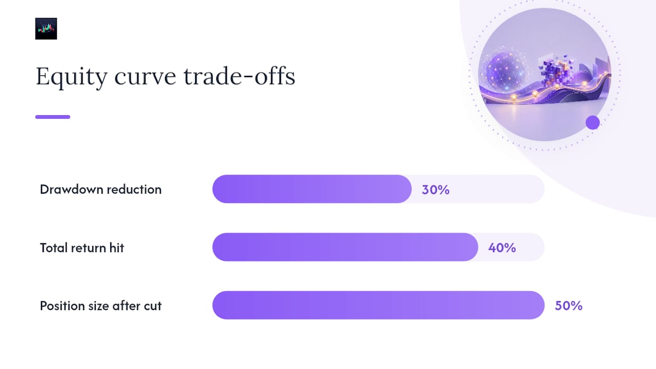
- Level 1: cut position size by half when equity breaches its moving average.
- Level 2: pause new entries entirely if drawdown exceeds your validated threshold.
- Level 3: trigger a full strategy review if the pause persists beyond your recovery lookback window.
Adaptive, regime-aware controls with graduated steps generally outperform single fixed cutoffs, because a hard binary rule can lock in losses during ordinary volatility instead of a real regime failure. Set your drawdown threshold using a Monte Carlo simulation of historical trade sequences, and target roughly 1.5 to 2 times the median simulated max drawdown as your pause trigger.
Pro Tip: Every filter smooths returns by trading away some upside. If a rule cuts your drawdown by 30% but also cuts total return by 40%, you haven't managed risk, you've just made a worse strategy. Test the trade-off explicitly before going live.
Your Equity Curve Analysis Workflow, Step by Step
Turning theory into practice means following the same sequence every time, not improvising when the curve looks scary.
Collect and clean your data first:
- Pull every trade with entry/exit timestamps, size, and realized P&L.
- Add commissions, spreads, and estimated slippage to build the net curve alongside the gross one.
- Flag any open positions separately so they don't distort the cumulative total.
Then run analysis in order: plot the curve, compute the core metrics (MDD, recovery factor, Ulcer Index), segment by regime, run a Monte Carlo simulation on trade sequencing, and finish with a walk-forward test that holds out recent data the filter never saw. Walk-forward and out-of-sample testing is what separates a real filter from one that's just curve-fit to your own history.
Your ongoing dashboard needs three things visible at all times: current slope versus historical average, current drawdown versus historical median, and time spent in the current drawdown versus typical recovery time. When a strategy gets paused, running it in a paper account and watching that curve for recovery avoids the trap of a strategy staying dark forever with no data to justify turning it back on. If the paper curve never recovers after a reasonable window, that's your signal to rebuild the logic or retire it.
How Discipline AI Supports Equity Curve Monitoring
Running this workflow by hand across dozens of trades a week gets tedious fast, and tedium is exactly when traders skip steps. The platform tracks trade-level P&L, execution quality, and drawdown thresholds continuously instead of waiting for a weekly spreadsheet review.
- Automated trade journaling logs every entry, exit, and fee so gross-versus-net divergence shows up immediately.
- Trade autopsies help separate a structural drawdown from ordinary noise by reviewing the conditions around each losing stretch.
- Behavioral coaching flags when a trader is about to override a validated pause rule out of frustration, which is often when the worst decisions happen.
- Performance analytics surface current drawdown against historical baseline without requiring a manual pull of trade history.
A Trader's Honest Take on Mechanical Rules
Equity curve filters work, but only when you treat them as governance, not alpha. A moving-average pause rule can't generate returns. It can only limit how much you give back before someone looks at the strategy seriously.
The mistake I see most is traders tightening a filter until the curve looks smooth in a backtest, then wondering why the smoothing disappeared live. Document your kill-switch levels and review cadence before a drawdown happens, not during one. And resist the urge to chase a smoother curve at the cost of the edge that made the strategy worth trading in the first place.
— Tony
Automate the Monitoring, Keep the Judgment
Building the dashboard described above by hand, every day, across multiple pairs or tokens, is where most traders quietly give up on equity curve discipline. This type of monitoring is useful for cryptocurrency, forex, and stock traders who want ongoing monitoring instead of reconstructing data from memory after a bad week. The platform's performance analytics track drawdown against your own historical baseline, while automated trade journaling and AI trade autopsies flag whether a losing stretch looks structural or ordinary.
None of this replaces the governance work: you still decide your pause thresholds and your review cadence. What automation buys back is the time and consistency to actually enforce them instead of skipping the check on a busy week. Start with Discipline AI to see your current equity curve, drawdown status, and execution quality in one place.
Sources
- How to Analyze Individual Equity Curves
- Trading the Equity Curves
- Risk Management | ML for Trading
- Equity Curve Trading - When to Pause a Strategy That Stops Working
- How to Use Equity Curves to Control Risk
FAQ
What is a good equity curve?
A good equity curve trends upward with shallow, short drawdowns and a recovery factor of 3 or higher, meaning profits consistently outpace the depth of losses along the way.
What is the 7% rule in stock trading?
The 7% rule is a stop-loss guideline that suggests exiting a losing position once it falls a modest percentage below your entry price, a discipline tool separate from equity-curve-based sizing rules.
What is an equity curve?
An equity curve is a plot of your cumulative net profit and loss over time or by trade sequence, used to judge trend, drawdown severity, and whether current position sizing is working.
How many trades do I need before trusting equity curve filters?
Most practitioner guidance suggests waiting for at least 100 trades per year before relying on moving-average or drawdown-based filters, since smaller samples produce unreliable signals.